Pantone
Pantone is the world-renowned authority on colour and a provider of colour systems and leading technology for the selection and accurate communication of colour across a variety of industries.
Amongst fashion designers, Pantone’s colour guides are iconic. Even if a designer doesn’t use a Pantone colour in their final product, they will more than likely have looked through the company’s colour book to get an idea of what they are looking for.
Before designers even begin brainstorming, the pantone colour experts will be trying to predict the colours they will want to use. Twice a year, Pantone representatives will meet with trend forecasters from all over the design world to discuss the colours that seem poised to take off in popularity.
When pantone is creating a new colour they must first figure out if there is room for it – what makes this colour different? They look through customer feedback and requests and see where there is a gap in the market.
“Colour is the language of life” – Laurie Pressman, Vice President of the Pantone Colour Institute
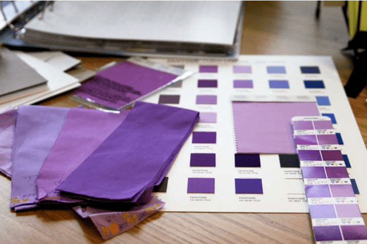
Purple Pantones
Purple is having a ‘moment’ and in 2014 pantone made ‘Radiant Orchid’ – a shade of purple, its ‘colour of the year’
Many consider Purple to be a complex colour and it has a long history of being used by Kings and emperors therefore is often regarded as a regal or prestigious colour. Though purple is now available to all it still is not widely used, especially when compared to other colours such as blue or black.
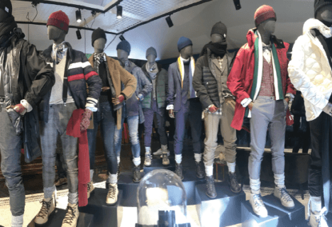
Men have traditionally favoured blue-based shades, however consumers are becoming more willing to experiment. It is also a gender-neutral colour and therefore open to both men and women.
When designing the uniform for the RBS Group we had shades of purple in their mood board to match with their newly refurbished branches. The purple is complimented by dark navy tailoring.
Prince’s Pantone
If you think of legendary musician Prince the one colour you would associate with him is purple and he has now been honoured with his own official Pantone shade. The late artist developed a love for the colour purple during his career, highlighted in the joint album, song and film Purple Rain.
Pantone Colour Institute have recently unveiled a new hue in his honour called ‘Love Symbol #2’ which was inspired by the purple shade of his signature Yamaha Piano.
Laura Pressman said the company were honoured to develop the shade in his memory and ‘Love Symbol #2’ is emblematic of Prince’s distinctive style. Pantone worked closely with Prince’s estate to develop the colour and entertainment adviser Tony Carter says “This is an incredible way for his legacy to live on forever”